In the next few subsections, we dive into the details of how we drew these conclusions.
3.2 Data pre-processing
To conduct deeper analysis on our data, we added the following columns to our dataset:
BMI: the Body Mass Index of each person, a continuous variable calculated using the World Health Organization guideline: \(BMI = \frac{Weight}{Height^2}\).
IsOverweight: a binary categorical value whose value is 1 if the BMI of the person is more than 25, 0 otherwise.
These columns serve as alternate metrics of the obesity of an individual, a continuous variable and a binary categorical variable, to complement NObeyesdad, the obesity category level which is a ordinal categorical variable.
These new columns can be found and used directly in the dataset scripts/xinyi-zhao_files/CleanObesityDataSet.csv.
In order to improve the visualization of certain plots, we also made local modifications to the data types of some columns for only that given plot. For instance, to plot the alluvial diagrams (figure 10), we rounded the values of the following: Frequency of consumption of vegetables (FCVC), Number of main meals (NCP), Physical activity frequency (FAF), Time using technology devices (TUE) (some of the values of these variables were floats, presumably because the researchers took an average of multiple time periods). This made sure that the variables are discrete (whole numbers).
3.3 Analysis of Height, Weight and BMI variables
Since the dataset contains artificially generated data, we first needed to verify that the dataset matches our expectations, notably by visualizing the distribution of these three continuous variables.
Code
# Importing the necessary libraries and datasetlibrary(readr)library(dplyr)library(tidyverse)library(stats)library(vcd)library(ggplot2)library(gridExtra)library(grid)library(GGally)library(reshape2)library(colorspace)library(plyr)library(ggalluvial) library(ggridges)data <-read_csv('scripts/xinyi-zhao_files/CleanObesityDataSet.csv',show_col_types =FALSE)
3.3.1 Verification of number of rows, columns, missing values
A preliminary verifications of the number of rows, columns and missing values of our dataset show that there does not seem to be any problems with the structure of our dataset.
Code
# Print a summary of number of rows, columns, missing valuescat("Number of rows in dataset: ", nrow(data), "\nNumber of columns in dataset: ", ncol(data),"\nNumber of missing values in dataset: ", sum(is.na(data)))
Number of rows in dataset: 2111
Number of columns in dataset: 20
Number of missing values in dataset: 0
3.3.2 Histogram
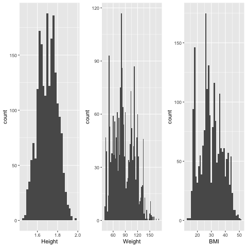
Additionally, the data seems to align with our expectations, visualizing the Height, Weight and BMI variables with a histogram (Fig. 1) shows that at first glance there is no anomalous data that stands out with respect to the people surveyed.
Code
# Histograms of Height, Weight and BMIplot1 <-ggplot(data = data, aes(x = Height)) +geom_histogram(binwidth =0.02)plot2 <-ggplot(data = data, aes(x = Weight)) +geom_histogram(binwidth =2)plot3 <-ggplot(data = data, aes(x = BMI)) +geom_histogram(binwidth =1)grid.arrange(plot1, plot2, plot3, ncol =3,top =textGrob("Histograms of the continuous variables Height, Weight and BMI",gp=gpar(fontsize=16)))
Fig. 1: Histograms of Height, Weight and BMI
3.3.3 Normality tests (Shapiro-Wilk test and QQ-plots)
We investigated whether three variables plotted in Fig. 1 follow a normal distribution by running the Shapiro–Wilk test (below) and plotting the QQ-plots of all three variables (Fig. 2).
Code
# Shapiro–Wilk test on height, weight, BMIshapiro.test(data$Height)
Shapiro-Wilk normality test
data: data$Height
W = 0.99323, p-value = 2.772e-08
Code
shapiro.test(data$Weight)
Shapiro-Wilk normality test
data: data$Weight
W = 0.9765, p-value < 2.2e-16
Code
shapiro.test(data$BMI)
Shapiro-Wilk normality test
data: data$BMI
W = 0.97475, p-value < 2.2e-16
Code
# QQ-Plot of Height, Weight and BMI in this order, plotted in a rowplot1 <-ggplot(data, aes(sample = Height)) +stat_qq() +stat_qq_line(col ="navy") +xlab("Height")plot2 <-ggplot(data, aes(sample = Weight)) +stat_qq() +stat_qq_line(col ="navy") +xlab("Weight")plot3 <-ggplot(data, aes(sample = BMI)) +stat_qq() +stat_qq_line(col ="navy") +xlab("BMI")grid.arrange(plot1, plot2, plot3, ncol =3)
Fig. 2: QQ-Plot of Height, Weight and BMI
Analysis of normality:
On the histogram, it seems like Weight does not follow a normal distribution as there are multiple local peaks at around 75kg, 90kg and 100kg), and neither does BMI since there is nobody whose BMI is less than 18 or higher than 50, hence the BMI distribution does not have a tail.
The height of the individuals does not appear to follow a normal distribution, as it appears to be multimodal (1.75m and 1.8m) and the Shapiro-Wilk normality test gives a p-value of 2e-8 << 0.05. This is not quite aligned with our expectations as height has been found by researchers to in general follow a normal distribution.
The weight of the individuals appears to have a slight right skew according to the QQ Plot (the plot “climbs slowly” for smaller values of the x axis). This is aligned with our expectations as body weight is found to have a right skewaccording to research.
The BMI of individuals appears to be in between a uniform distribution and a normal distribution from the QQ Plot (flat for small and big values on the theoretical normal quantiles, but not flat enough to be a true uniform distribution). This is not collaborated by other research that has found that the distribution of BMI is right-skewed, for instance by Briese et. al (2011). Yet, this is to be expected since the researchers artificially generated more high BMI data points to balance out the class imbalance.
3.3.4 Boxplot of BMI
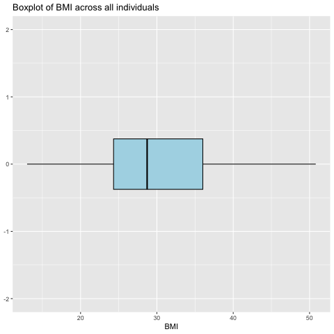
Afterwards, we plotted a boxplot (Fig. 3) to better understand the other statistics (e.g. median, outliers) of the variable BMI.
Code
# Boxplot to visualize the BMI across all individuals ggplot(data, aes(x=BMI)) +geom_boxplot(fill ="lightblue", color ="black") +coord_cartesian(ylim =c(-2, 2)) +labs(title ="Boxplot of BMI across all individuals")
Fig. 3: Boxplot to visualize the BMI across all individuals
Code
fivenum(data$BMI)
[1] 12.99868 24.32580 28.71909 36.01650 50.81175
The Tukey Five-Number summary tells us the following: - Minimum BMI is 13
Lower hinge is 24
Median is 28.7
Upper hinge is 36.0
Maximum BMI is 50.8
Since the median is at 28.7 > 25, more than half of the sample corresponds to overweight individuals (generated or real people). Since the lower hinge is at 24 (normal weight), we also know that less than 25% of the individuals in the dataset are underweight, and also less than 25% of the individuals in the dataset are of normal weight.
Therefore, this dataset has much more data of overweight people than expected, which makes sense since the obesity level category divides “overweight” into five different categories (Overweight I & II, Obesity I, II, III).
3.3.5 Ridgeline plot of weight
Lastly, we made a ridgeline plot of weight of individuals across Obesity Types (Fig. 4).
Code
# Ridgeline Plot of weight of individuals across Obesity Typesggplot(data, aes(x = Weight, y = NObeyesdad, fill = NObeyesdad)) +stat_density_ridges(alpha =0.7) +scale_fill_viridis_d() +labs(title ="Ridgeline Plot of Obesity Types", x ="weight", y ="Obesity Type") +theme_ridges()
Fig. 4: Ridgeline Plot of weight of individuals across Obesity Types
This ridgeline plot illustrates that the distributions of normal weight, insufficient weight, and overweight categories exhibit unimodal characteristics, closely resembling a normal distribution. In contrast, the obesity category displays a bimodal distribution with a notably wider range.
3.4 Exploratory data analysis of variables potentially correlated with BMI
3.4.1 Scatterplot of each pair of numeric variables in the dataset
We wanted to first find out whether there are any obvious correlations between any pair of numeric variables in the dataset. This will help us to figure out if there are any variables to focus our subsequent analyses on. Fig. 5 presents a scatterplot of each pair of numeric variables in the dataset.
Code
# Scatterplot of each pair of numeric variables in the datasetset.seed(123456) # Seed so that the sampling is reproducible#data <- data %>%# mutate_if(is.numeric, scale) # Scale only numeric variablesdata_num <- data[c("Age", "Height", "Weight", "NCP", "CH2O", "FAF", "TUE","BMI")] # Select the variable that we want to plot# Convert all columns to numericdata_num <-sapply(data_num, as.numeric)# Sample 300 points for clearer visualization as all 2000 plots gives a cluttered scatterplotdata_sampled <-sample_n(as.data.frame(data_num), 300)ggpairs(as.data.frame(data_sampled), aes(alpha =0.4, size =0.02), upper =list(continuous =wrap("cor", size =12))) +theme(text =element_text(size =35)) # Decreased the size and alpha to have more readable scatter plots
Fig. 5: Scatterplot of each pair of numeric variables in the dataset
Based on this scatterplot, we can gain the following insights:
Sanity check: there is a strong correlation between weight and BMI (r = 0.941) and height and weight (r = 0.493).
Most variable pairs have an extremely low correlation (less than 0.2). There are only four pairs that have a correlation of greater than 0.2: BMI/Age, NCP/Height, CH2O/Height, FAF/Height. Yet none of these variables are correlated with weight or BMI.
This shows that each of the variables are interesting on their own since they have little correlation between each other, and that it would not be useful to remove any of the variables as each of them might bring us some unique insight to understand obesity.
3.4.2 Heatmap of correlations between numerical variables
Code
# Heatmap of correlations between numerical variablescategories <-c('Insufficient_Weight','Normal_Weight', 'Overweight_Level_I', 'Overweight_Level_II', 'Obesity_Type_I', 'Obesity_Type_II','Obesity_Type_III')# Create a mapping from category to integercategory_mapping <-setNames(1:length(categories), categories)data$NObesity_numeric <-as.integer(factor(data$NObeyesdad, levels = categories))data_pca <- data[c("FCVC","NCP","FAF","TUE","NObesity_numeric")]cor_matrix <-cor(data_pca)# Reshape the data for heatmapmelted_cor <-melt(cor_matrix)# Creating heatmapggplot(melted_cor, aes(Var1, Var2, fill = value)) +geom_tile() +geom_text(aes(label =ifelse(value >0.1&value<1, round(value, 2), '')), color='darkblue',vjust =1) +scale_fill_gradient2(midpoint =0) +theme_minimal() +theme(axis.text.x =element_text(angle =45, hjust =1)) +ggtitle("Heatmap of Correlations")
Fig. 6: Heatmap of correlations between numerical variables
Analyzing the heatmap of correlations among numerical variables reveals two notable insights:
There is a surprisingly high positive correlation between the frequency of vegetable consumption and obesity. Contrary to the common assumption that increased vegetable intake correlates with healthier living, the data interestingly suggests that higher vegetable consumption frequencies may be associated with an increased tendency towards being overweight.
A positive relationship exists between the frequency of physical activity and the number of main meals consumed. This aligns well with practical observations, as individuals engaging in more physical activities typically expend more energy, thereby necessitating increased food intake to compensate for the energy loss.
Code
ggplot(data, aes(x = FCVC, y = NObeyesdad, fill = NObeyesdad)) +stat_density_ridges(alpha =0.7) +scale_fill_viridis_d() +labs(title ="Ridgeline Plot of Obesity Types", x ="Frequency of Vegetable Consumption", y ="Obesity Type") +theme_ridges()
Fig.7 Ridgeline Plot of frequency of vegetables of individuals across Obesity Types
In-depth examination of Figure 7 indicates that individuals classified as underweight exhibit a higher frequency of vegetable consumption. In contrast, those categorized as overweight and in the obesity type I and II classifications demonstrate a lower frequency of vegetable consumption. Notably, the trend shifts for individuals with obesity type III, the classification for extreme obesity, where there is an observable increase in vegetable consumption frequency.
3.4.3 Density plots for numerical variables
Code
# Creating individual density plots with smooth linesplot_fcvc <-ggplot(data, aes(x = FCVC)) +stat_density(fill="blue", alpha=0.5) +ggtitle("FCVC Density Plot") +xlab("FCVC") +ylab("Density")plot_ncp <-ggplot(data, aes(x = NCP)) +stat_density(aes(y = ..density..), geom ="area", fill="blue", alpha=0.5) +ggtitle("NCP Density Plot") +xlab("NCP") +ylab("Density")plot_faf <-ggplot(data, aes(x = FAF)) +stat_density(aes(y = ..density..), geom ="area", fill="blue", alpha=0.5) +ggtitle("FAF Density Plot") +xlab("FAF") +ylab("Density")plot_tue <-ggplot(data, aes(x = TUE)) +stat_density(aes(y = ..density..), geom ="area", fill="blue", alpha=0.5) +ggtitle("TUE Density Plot") +xlab("TUE") +ylab("Density")# Arrange the plots in a 2x2 gridgrid.arrange(plot_fcvc, plot_ncp, plot_faf, plot_tue, nrow =2)
Fig. 8: Density plots for Frequency of consumption of vegetables (FCVC), Number of main meals (NCP), Physical activity frequency (FAF), Time using technology devices (TUE)
The analysis of density plots for various numerical variables reveals some intriguing patterns, particularly in the distribution of integer versus float values:
The frequency of vegetable consumption predominantly clusters around integer values, with 1 and 3 being notably prevalent. This suggests a strong tendency for surveyed individuals to consume vegetables either once or thrice within a given time frame.
The number of main meals consumed typically centers around the integer value 3. This indicates that a majority of the surveyed individuals adhere to a traditional three-meals-a-day eating pattern.
The frequency of physical activity demonstrates a clear inclination towards 1 or 2 sessions per week. This pattern highlights a general trend in physical activity habits.
In terms of technology device usage frequency, there is a significant skew towards the lower end of the spectrum. The data suggests that most surveyed people either seldom use technology devices or do so only occasionally.
3.5 Correlation between biological factors/the existence of certain lifestyle habits and obesity
3.5.1 Bivariate Mosaic Plots of existence of certain lifestyle habits against IsOverweight
We now seek to analyze the categorical binary variables in our dataset and their links with obesity, namely
Gender
Family History of Overweight
Frequent counsumption of high caloric food
Whether the person smokes
Whether the person monitors caloric consumption
We did this by plotting five mosaic plots of each variable against whether the person is overweight (BMI > 25), as follows in Fig. 8a to 8e.
Code
# Create a mosaic plot for each variable in the table plotted against 'IsOverweight'data_mosaic <- data[c("Gender", "family_history_with_overweight","FAVC","SMOKE","SCC","IsOverweight")]# Changing the factor levels for the mosaic plotdata_mosaic$family_history_with_overweight <-fct_relevel(data_mosaic$family_history_with_overweight, "yes", "no")data_mosaic$SMOKE <-fct_relevel(data_mosaic$SMOKE, "yes", "no")data_mosaic$FAVC <-fct_relevel(data_mosaic$FAVC, "yes", "no")data_mosaic$SCC <-fct_relevel(data_mosaic$SCC, "yes", "no")#data_mosaic$IsOverweight <- as.character(data_mosaic$IsOverweight)#data_mosaic# For loop to plot one mosaic plot for each variablefor(var innames(data_mosaic)[names(data_mosaic) !="IsOverweight"]) { contingency_table <-table(data_mosaic[[var]],data_mosaic$IsOverweight)mosaicplot(contingency_table, main =paste("Mosaic Plot for", var), ylab ="Is Overweight", xlab = var, col =c("pink", "brown"))}
Fig. 9a: Mosaic Plot of Gender against IsOverweight
Fig. 9b: Mosaic Plot of Family History against IsOverweight
Fig. 9c: Mosaic Plot of Frequent consumption of high caloric food against IsOverweight
Fig. 9d: Mosaic Plot of weight of whether the person smokes against IsOverweight
Fig. 8e: Mosaic Plot of calories consumption monitoring against IsOverweight
Overall conclusion from this mosaic plot: There is little correlation between whether a person is overweight and their gender, as well as overweight/whether they smoke, whereas there is a large correlation between overweight/having a family history with overweight, overweight/frequent consumption of high caloric foods, overweight/calories consumption monitoring.
3.5.2 Trivariate Mosaic Plot of existence of certain lifestyle habits against IsOverweight
Next, we want to further analyze the correlations between these binary categorical variables and IsOverweight by plotting a multi-variate mosaic plot. We do this for the three variables in the previous binary mosaic plots that have shown to be the most correlated with IsOverweight, namely SCC, frequent consumption of high caloric foods, FAVC frequent consumption of high caloric food, and family_history_with_overweight. This multi-variate mosaic plot is presented in Fig. 9.
Fig. 10: Multi-variate mosaic plot visualizing family_history_with_overweight, calories consumption monitoring and frequent consumption of high caloric food vs IsOverweight
We can see that the individuals have a family history with overweight have a much higher correlation with being overweight than individuals who do not have a family history with overweight. The group that has all the unhealthy habits but has no family history with being overweight has a lower correlation with being overweight compared to all groups which have a family history of being overweight, even the group that has a family history with being overweight but no unhealthy habits. This shows that, in the binary categorical variables, having a family history of being overweight has the highest correlation of someone actually being overweight.
3.5.3 Two multivariate alluvial diagrams
Lastly, we analyze the categorical ordinal variables using two multivariate alluvial diagrams (Fig. 10a to 10c). These variables are “neutral” lifestyle habits such as the time on electronics (a), alcohol consumption (a), number of meals (b), water consumption a day (b), which based on common knowledge do not have appear to have a correlation with somebody’s BMI. We visualized a person’s physical activity frequency in a third alluvial diagram (c) for better visibility.
Code
# Data preprocessing for the alluvial diagramdata_alluvial <- data[c("Age", "NObeyesdad", "NCP", "CH2O", "FAF", "CALC", "TUE")] # selecting relevant variables# Rounding the numeric values to the nearest integerdata_alluvial$CH2O <-as.numeric(data_alluvial$CH2O)data_alluvial$CH2O <-round(data_alluvial$CH2O)data_alluvial$NCP <-as.numeric(data_alluvial$NCP)data_alluvial$NCP <-round(data_alluvial$NCP)data_alluvial$FAF <-as.numeric(data_alluvial$FAF)data_alluvial$FAF <-round(data_alluvial$FAF)data_alluvial$TUE <-as.numeric(data_alluvial$TUE)data_alluvial$TUE <-round(data_alluvial$TUE)# Grouping the Overweight and Obese values of Obesity Category together to make the diagram more readabledata_alluvial <- data_alluvial %>%mutate(Obesity_Category =case_when( NObeyesdad %in%c("Overweight_Level_I", "Overweight_Level_II") ~"Overweight", NObeyesdad %in%c("Obesity_Type_I", "Obesity_Type_II") ~"Obese", NObeyesdad =="Normal_Weight"~"Normal", NObeyesdad =="Insufficient_Weight"~"Underweight" ))
Code
# Acronyms: CALC (consumption of alcohol), TUE (time on electronics), FAF (physical activity), CH2O (daily water), NCP (number of main meals)# Reformatting the data to plot alluvial diagramdata_alluvial_2 <- dplyr::count_(data_alluvial,vars =c("Obesity_Category", "FAF", "CALC", "NCP", "CH2O", "TUE"))# Renaming the Freq columncolnames(data_alluvial_2)[colnames(data_alluvial_2) =="n"] <-"Freq"# Changing factor levels for Obesity Categorydata_alluvial_2$Obesity_Category <-factor(data_alluvial_2$Obesity_Category, levels =c("Underweight", "Normal", "Overweight", "Obese"))# Plotting the alluvial diagramggplot(as.data.frame(data_alluvial_2), aes(y = Freq, axis1 = Obesity_Category, axis2 = TUE, axis3 = FAF)) +geom_alluvium(aes(fill = Obesity_Category), width =1/12) +geom_stratum(width =1/12, fill ="grey80", color ="grey") +geom_label(stat ="stratum", aes(label =after_stat(stratum))) +scale_fill_brewer(type ="qual", palette ="Set1") +expand_limits(x =0, y =0) +ggtitle("Obesity category vs Time on Electronics vs Alcohol consumption") +theme_void() +theme(plot.margin =margin(0,0,0,0, "cm"))
Fig. 11a: Alluvial diagram of Obesity category vs Time on Electronics vs Alcohol consumption
Code
# Acronyms: CALC (consumption of alcohol), TUE (time on electronics), FAF (physical activity), CH2O (daily water), NCP (number of main meals)# Plotting the alluvial diagramggplot(as.data.frame(data_alluvial_2), aes(y = Freq, axis1 = Obesity_Category, axis2 = NCP, axis3 = CH2O)) +geom_alluvium(aes(fill = Obesity_Category), width =1/12) +geom_stratum(width =1/12, fill ="grey80", color ="grey") +geom_label(stat ="stratum", aes(label =after_stat(stratum))) +scale_fill_brewer(type ="qual", palette ="Set1") +expand_limits(x =0, y =0) +ggtitle("Obesity category vs Nb of meals vs Water consumption a day") +theme_void() +theme(plot.margin =margin(0,0,0,0, "cm"))
Fig. 11b: Alluvial diagram of Obesity category vs Nb of meals vs Water consumption a day
Code
# Acronyms: CALC (consumption of alcohol), TUE (time on electronics), FAF (physical activity), CH2O (daily water), NCP (number of main meals)# Plotting the alluvial diagramggplot(as.data.frame(data_alluvial_2), aes(y = Freq, axis1 = Obesity_Category, axis2 = FAF)) +geom_alluvium(aes(fill = Obesity_Category), width =1/12) +geom_stratum(width =1/12, fill ="grey80", color ="grey") +geom_label(stat ="stratum", aes(label =after_stat(stratum))) +scale_fill_brewer(type ="qual", palette ="Set1") +expand_limits(x =0, y =0) +ggtitle("Obesity category vs physical activity frequency") +theme_void() +theme(plot.margin =margin(0,0,0,0, "cm"))
Fig. 11c: Alluvial diagram of Obesity category vs Physical activity frequency (FAF)
From these alluvial diagrams, we can see that there does not appear to be a clear correlation between the obesity category a person is in with these neutral lifestyle habits, which corresponds to our intuition. What is more surprising is that we do not see a clear correlation either between a person’s obesity level and their physical activity frequency. This could be because physical activity are both important for healthy people to maintain a healthy weight, but is also something that overweight people actively try to do to lose weight.


