4 Interactive graph
4.1 Introduction to the d3 interactive visualization:
Here is the parallel coordinate plot we created using d3. The color of each line in the graph represents a category of obesity. This categorization makes it easier to visually distinguish different types of obesity data. A legend on the right side of the graph will explain the color coding, clarifying which color corresponds to which type of obesity.
Users can manually select which columns they want to visualize using a selection form with checkboxes. The form includes options for various variables like Age, Height, Weight, FCVC, NCP, FAF, TUE, BMI and NObeyesdad. After making their selections, users can click an ‘Update’ button to refresh the visualization with their chosen columns.
This allows users to customize the graph based on the variables they are most interested in.
4.2 Interactive Features:
Dragging Axis: Users can drag the axes to reorder them. This feature is useful for exploring the relationships between different variables more effectively.
Brush Selection Ranges: This allows users to select specific ranges on each axis. Only data points that fall within all selected ranges across the axes will be displayed.
Hovering and Highlighting: When a user hovers over a particular category of data, that category will be highlighted. This makes it easier to focus on and analyze specific subsets of the data.
4.3 Findings:
If we choose all these variables the graph would be like this:
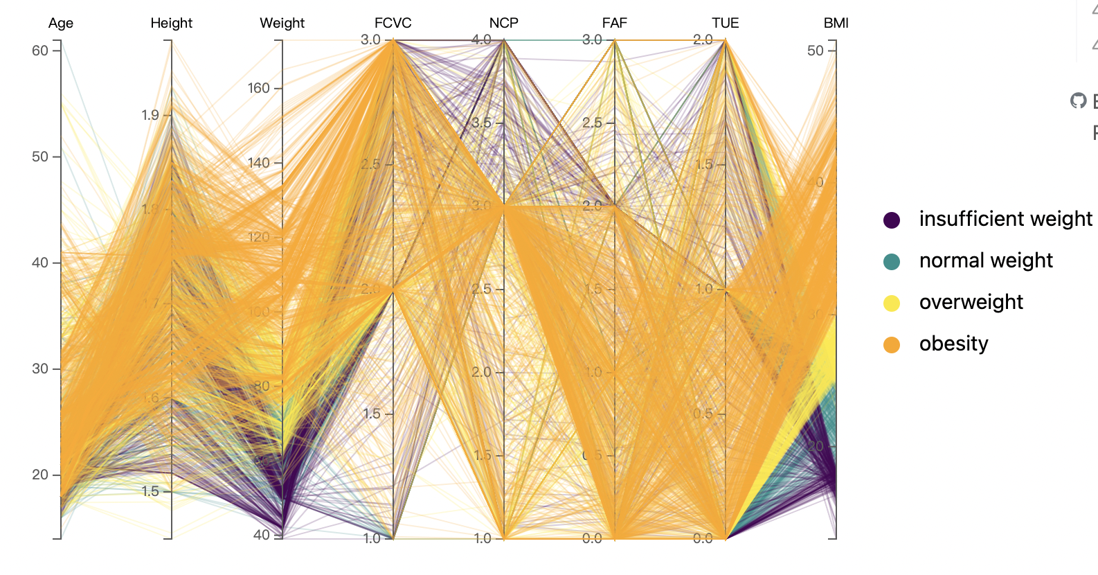
After various interactions we had the following findings:
Younger people are more tend to have a normal weight or underweight, while obesity people ages have a wide age range.
There’s a clear trend of increasing weight with the progression from insufficient weight to obesity. The lines representing obesity (orange) tend to be on the higher end of the weight scale.
The lines for overweight and obesity (yellow and orange) show high values for FCVC, suggesting that individuals in these categories tend to consume vegetables more frequently.
Most of the number of main meals(NCP) values across all categories are around the value of 3, which suggests that independent of weight category, the majority of individuals consume around three main meals a day.
There seems to be a clustering around lower values for the obesity category, indicating less frequent physical activity.
As expected, the BMI increases from insufficient weight to obesity. The orange lines, indicating obesity, are consistently at the higher end of the BMI scale.